Udacity Data Scientist Nanodegree: Project 2
As part of the udacity.com Data Scientist nanodegree, this is project two of the program.
Following a disaster, there are millions of tweets, news alerts, or social media and online messages that are generated. During this critical time, organizations are overwhelmed with data and they need to filter out what is pertinent information from what is just noise. One response organization might be interested in information about water needs, another might have resources standing by to respond to issues with roads or medical supplies, etc. But is someone just commenting on water or urgently asking for clean water needs without using the word water?
There is not enough time for humans to parse through so much data in time for the correct organization to respond effectively. Only one in every 1,000 messages might be important.
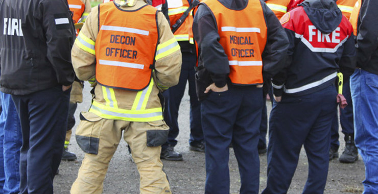
 Source: Hurricane Dorian Relief and Recovery Fund image by GlobalGiving from https://www.globalgiving.org/projects/hurricane-dorian-relief-fund/
Figure Eight, a company specializing in AI data solutions, has provided real social media and online messages that were generated in an actual emergency that will be used for this project.
This project involves a Disaster Response Pipeline dashboard web application showcasing the following Data Science and Software Engineering Best Practices:
- GitHub and Code Quality including a GitHub repository along with code comments, docstring in each function, class, or method, unit tests, and logical functions and PEP8 style guideline conventions
- ETL or Extract Transform Load data setup of a clean dataset
- Machine Learning including NLP techniques to process text data and the proper use of pipelines and grid search, training vs. test data, and model evaluation
- Deployment of our web application showing our Disaster Response Pipeline visualizations
 Source: California Air Resources Board https://ww2.arb.ca.gov/our-work/topics/smoke
What Exactly is This Project?
This project was a full stack end to end development effort. I took two raw CSV files, one containing the raw messages and corresponding English translations, and the second CSV file containing the categories that Figure Eight originally generated. Remember, Machine Learning is about “training” your model or telling it “here are the questions and answers for you to ‘learn.’ Use part of the data to ‘lean’ and take the remaining data to test how effective your ‘learning’ was.” I took the model I developed and evaluated to showcase it in a web application. This web application allows users to input text messages that allow the model to predict what emergency response categories the message would trigger, if any. There were 3 major Python scripts that were developed as described below.

Source: When Is Tornado Season in the US? How to Keep Your Family Safe https://preparedhero.com/blogs/articles/tornado-season
ETL Pipeline
This was a separate Python script to simply load the data files into a merged Pandas data frame. I then cleaned the data as there were duplicates and it was not in a format convenient for a machine learning model. Finally, the ETL script loaded this data into a SQL Lite database from which our Text Processing and Machine Learning pipeline could read from. We also wanted to make sure that all our functions were properly documented using Python docstring comments and that we properly refactored any code to keep the logic clean. Also, by breaking out or code into separate Pipelines we learned that we could better scale our solutions. Running logic in Pipelines, we could run simultaneous code or scale out based on data size or demands.
Text Processing and Machine Learning Pipeline
This was a second Python script that took the cleaned-up data from the SQL Lite database that our ETL Pipeline processed. It then tested, evaluated, and persisted our model for use by our UI web application dashboard.

Source: What is Natural Language Processing (NLP)? by Anwesha Roy from https://www.cxtoday.com/contact-centre/what-is-natural-language-processing-nlp/
Learning about NLP or Natural Language Processing was the most interesting part of this project. Many of the concepts used to teach a machine how to understand language are also involved in understanding images as well. The NLTK Python package was at the heart of our NLP logic. I coded logic to do things like tokenize our text and removed common stop words (e.g., a, the, of, etc.) Turns out that when you remove stop words from a sentence you retain the meaning of the text but “normalize” the text for a machine to better parse and compare to similar text (You see: Turns out when remove stop words sentence retain meaning text “normalize” text machine better parse compare similar text). I also coded a class called UrgencyWordExtractor that compared given text to a list of known synonyms for the word emergency as defined by Oxford Dictionary on Lexico at https://www.lexico.com/synonyms/emergency.
Another interesting functionality NLTK offers is the ability to break down text into parts of speech. This is useful for understanding context in a sentence, e.g., the archer took the shot with the bow and then took a bow. NTLK can help us distinguish the parts of speech by tagging the first transitive verb shoot/shot with the bow from the intransitive verb took/take a bow.
:upscale()/2021/07/26/775/n/37139775/68351883a4670cef_GettyImages-1163949439.jpg) Source: Valentina Acosta, Archery: These 9 Latinas Competing at the 2021 Tokyo Olympics Are Forging New Paths from https://nerdreactor.com/2017/07/07/jeremy-renner-broke-arms-movie-stunt/
Source: Valentina Acosta, Archery: These 9 Latinas Competing at the 2021 Tokyo Olympics Are Forging New Paths from https://nerdreactor.com/2017/07/07/jeremy-renner-broke-arms-movie-stunt/
Deep learning and neural networks were something we covered but did not include in our final model. This goes beyond machine learning into the fringe of artificial intelligence. It involves the type of word association our brain makes when it comes to “guessing” or filling in the blanks for words that have an association in a given context. For example, take the sentences “I love hot ____ in the morning” or “I cannot function in the morning until I have a cup of ___.” Our brain knows how to limit the possible choices down to maybe “tea” but more likely “coffee.” We can closer associate “tea” and “coffee” here. In this example the words closely associate. But in this other example or “plane” the two do not have as close of an association: “I like to read the ___ leaves in my cup.” When you see words like January, February, March … our brains are immediately thinking “months” and I know the relationship and order. We can teach machines the same thing to better understand language and context. This is especially useful in image recognition for a machine to know the type of features to expect in identifying a human face on a pedestrian versus an automobile or road sign. Pretty neat, huh?

Source: 9 Real-World Problems that can be Solved by Machine Learning from https://marutitech.com/problems-solved-machine-learning/
We split our input data into a test dataset for learning and a second dataset to evaluate the effectiveness of our model. Model effectiveness is shown by generating a report that recorded the model’s resulting precision and recall. These terms are best defined in Wikipedia:
Precision (also called positive predictive value) is the fraction of relevant instances among the retrieved instances, while recall (also known as sensitivity) is the fraction of relevant instances that were retrieved. Both precision and recall are therefore based on relevance.
Consider a computer program for recognizing dogs (the relevant element) in a digital photograph. Upon processing a picture which contains ten cats and twelve dogs, the program identifies eight dogs. Of the eight elements identified as dogs, only five actually are dogs (true positives), while the other three are cats (false positives). Seven dogs were missed (false negatives), and seven cats were correctly excluded (true negatives). The program’s precision is then 5/8 (true positives / selected elements) while its recall is 5/12 (true positives / relevant elements).
Our resulting optimized model was in the mid 60% range for both precision and recall.
Source: How AI Makes Precision Medicine More Accurate by Rehan Ijaz from https://www.healthworkscollective.com/how-ai-makes-precision-medicine-more-accurate/
I also reported the model’s F-score, again best defined by Wikipedia:
In statistical analysis of binary classification, the F-score or F-measure is a measure of a test’s accuracy. It is calculated from the precision and recall of the test, where the precision is the number of true positive results divided by the number of all positive results, including those not identified correctly, and the recall is the number of true positive results divided by the number of all samples that should have been identified as positive. Precision is also known as positive predictive value, and recall is also known as sensitivity in diagnostic binary classification.
The F1 score is the harmonic mean of the precision and recall. The more generic Fβ score applies additional weights, valuing one of precision or recall more than the other.
And using a Python module known as “pickle” we were able to store our model in a file that could be read and used by others, mainly by our web application.
Source: Hurricane Charlie’s visit to Port Charlotte, FL Friday August 13, 2004 https://activerain.com/blogsview/642278/hurricane-charlie-s-visit-to-port-charlotte–fl-friday-august-13–2004
Web Application Dashboard
The 3rd and final major Python script for this project involved the resulting web application dashboard. I used a framework called Flask that allowed us to use Python to generate HTML5; as well as Bootstrap 5.0 for our stylesheets and Javascript code to generate the reactive navigation and visualization pages. I also used Gunicorn to deploy the web application to Heroku, a cloud-based hosting environment. The Heroku hosted web application can be found HERE.
The web application plots two visualization to show the user the makeup of the underlying model training and test data. It also allows the user to input any text message to see how the machine learning model “categorizes” the message or returns what emergency service category or categories the message would be flagged for. Again, keep in mind the model is currently optimized at only about 60% or so of accuracy.
Source: bbc.co.uk Flooding: Have you been affected? https://www.bbc.co.uk/newsround/50347521
Conclusion
The dataset we were given was imbalanced (i.e., some labels like “water” have few examples and others like “search_and_rescue”, “security”, “child_alone”, “shelter”, “clothing”, etc. had none). We discovered this when first evaluating our model and seeing Scikit warnings that read “UndefinedMetricWarning: Precision is ill-defined and being set to 0.0 in labels with no predicted samples.” This imbalance affected training the model because our overall precision, recall, f1-score were skewed (with so many 0 results the averages were pulled down). Unlike with other data like financials, temperature readings there really is no way to necessarily impute the data. I cannot simply average out these gaps or even do other imputing strategies like fill forward or fill back data. NLP or Natural Language Processing does not give us these imputing options. Best we might do here to get a better evaluation result would be to emphasize the stats on the categories we know are not missing by passing the labels for the categories we do have.
I especially enjoyed the text processing or NLP (Natural Language Processing) aspects and techniques of this project but also liked the fact I could use Python to generate some very clean and modern Bootstrap based web HTML5 pages. It underscores the staying power of the Python language in that it can be adapted for so many different solutions.
Source: What psychologists do on disaster relief operations from https://www.apa.org/topics/disasters-response/relief
Given more time I would have customized the web application dashboard further, using more of the fontawesome icons, adding some animation, and making the list of selected categories more reactive. Also, I would have included unit tests rather than running code from my Jupyter Notebook to test snippets. And finally, I would have made the model pipeline component a module in PyPi.org to avoid having to depend on hardcoding module paths or moving run.py from app to the root folder for Heroku deployments.
Acknowledgements
Several code snippets came from previous lessons in our Udacity Data Scientist program. Also, where employed I have credited various contributors from StackOverflow.com, geeksforgeeks.org at https://www.geeksforgeeks.org/, https://www.tutorialspoint.com/ for sample plotly graphs, and the Data Science Stack Exchange at https://datascience.stackexchange.com. A big thank you to our instructors and all those involved in the Udacity program.